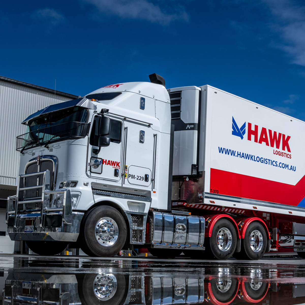
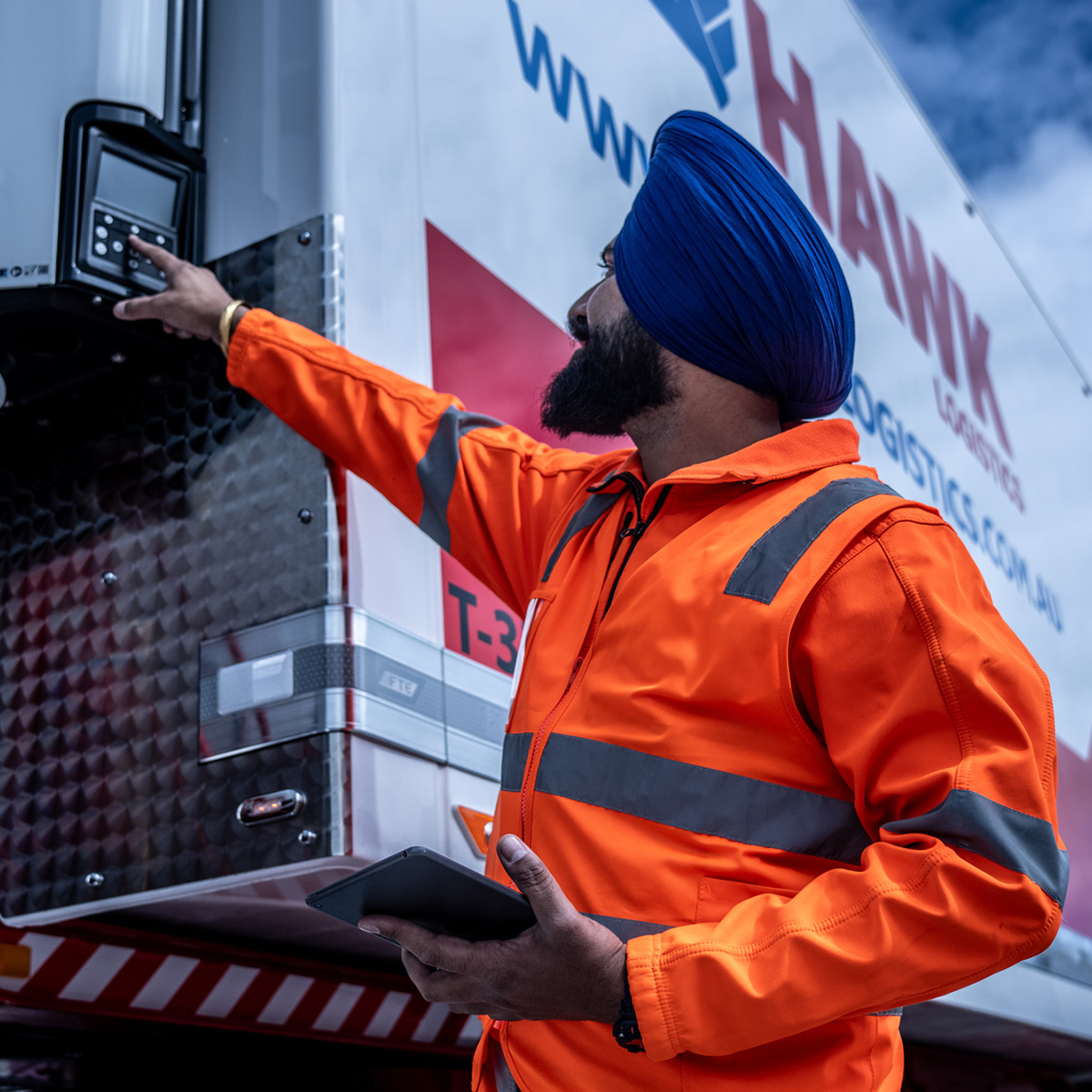
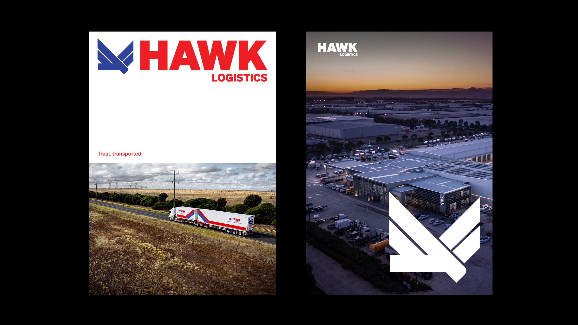
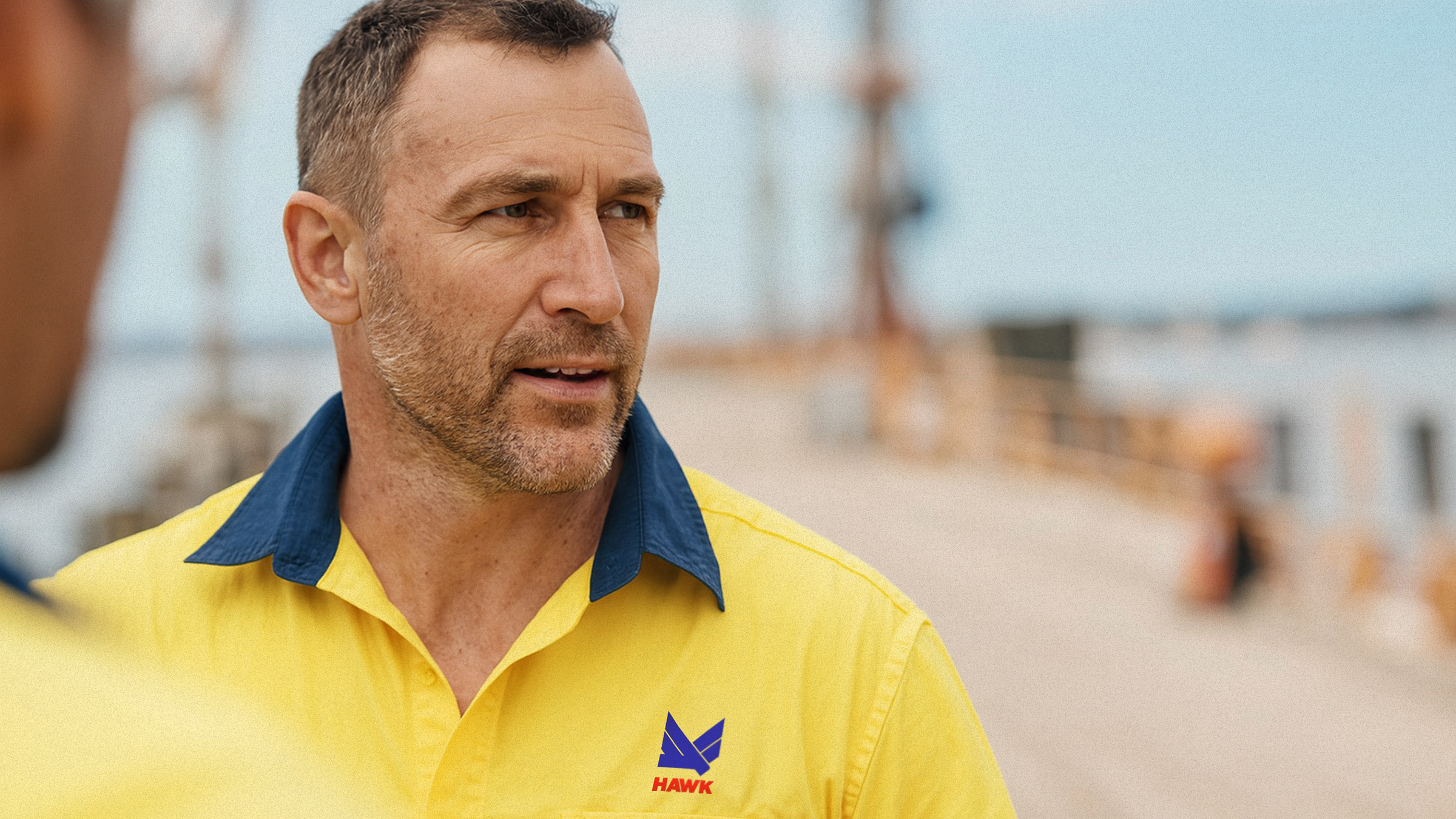
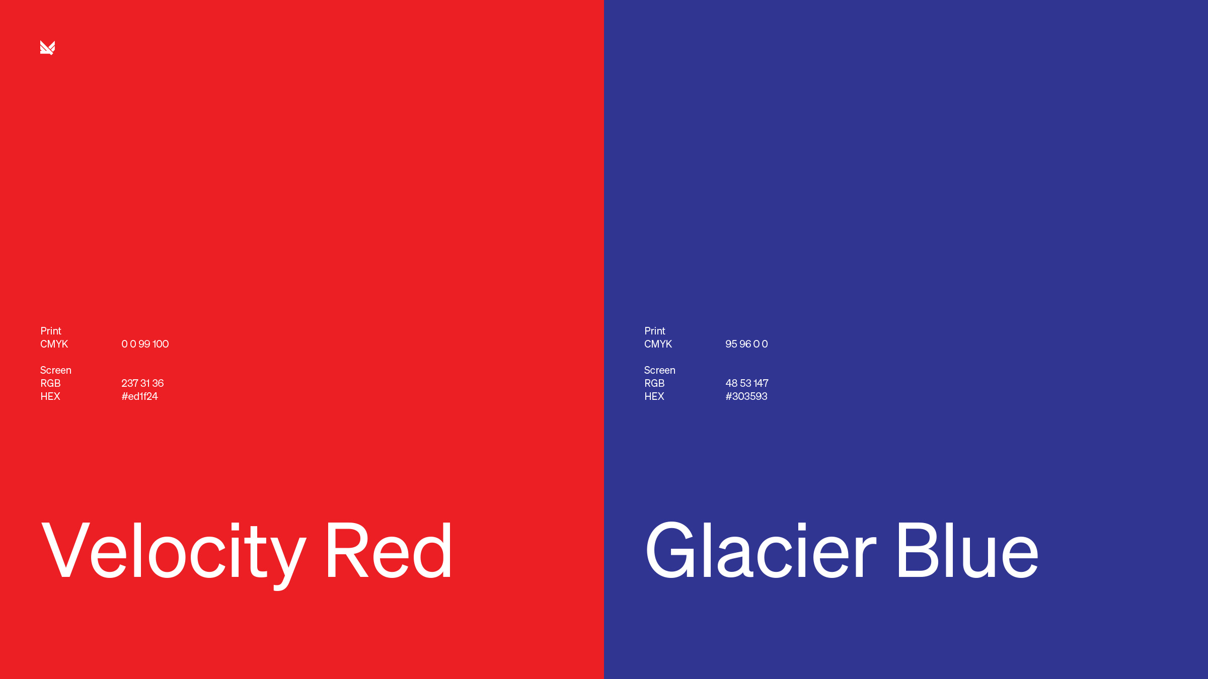
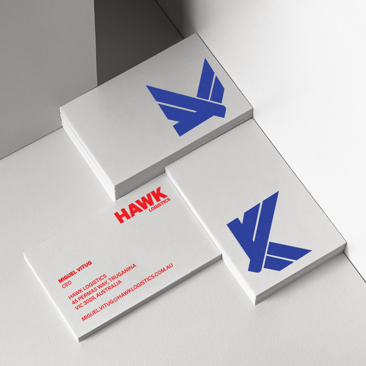
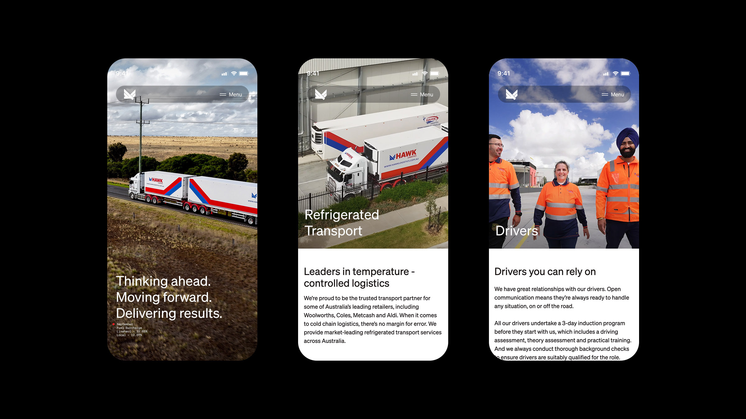
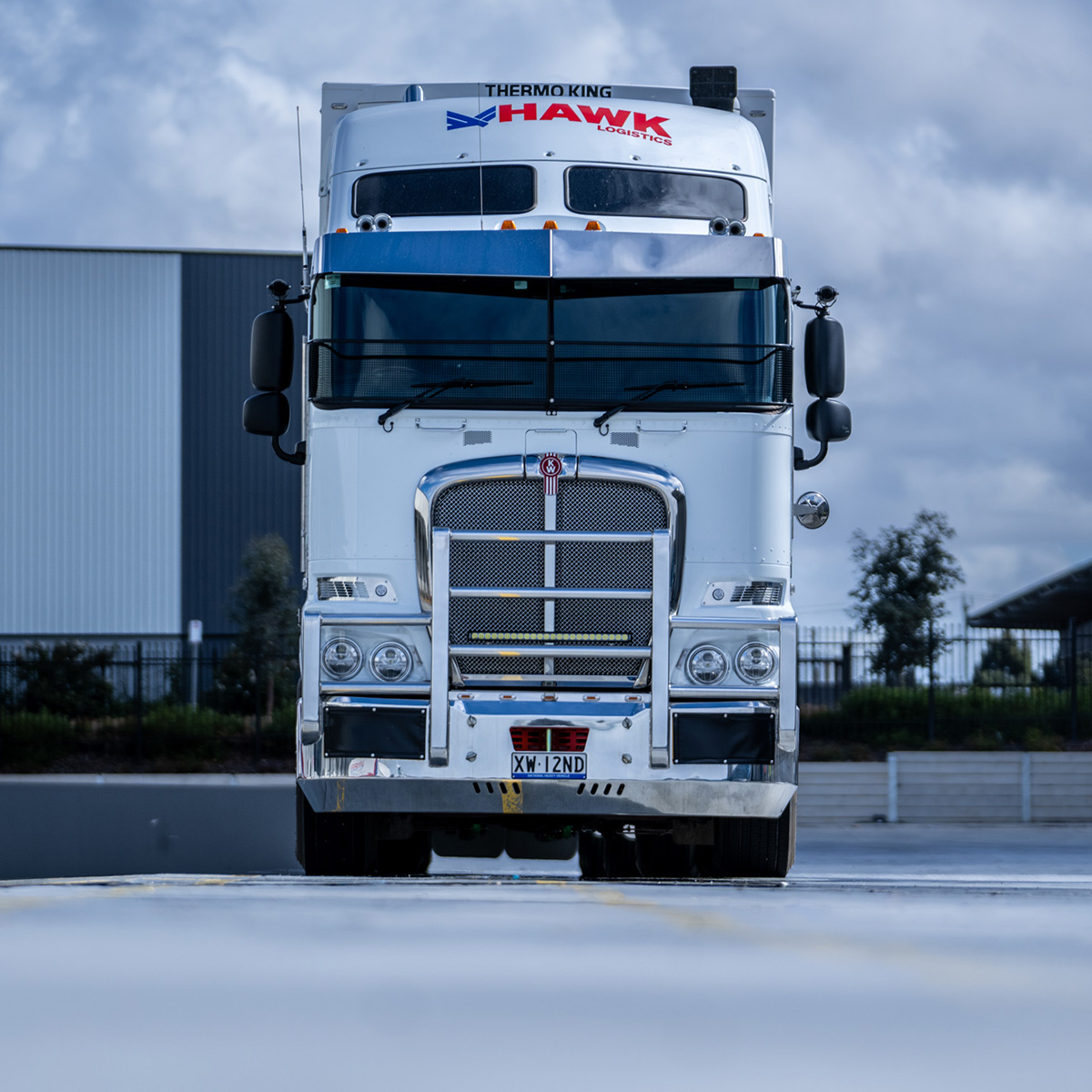
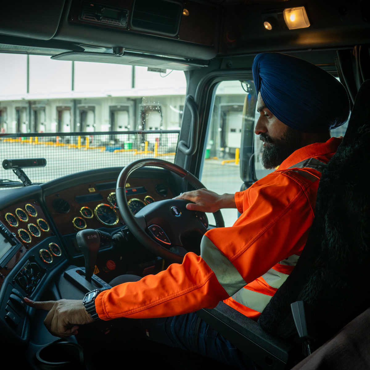
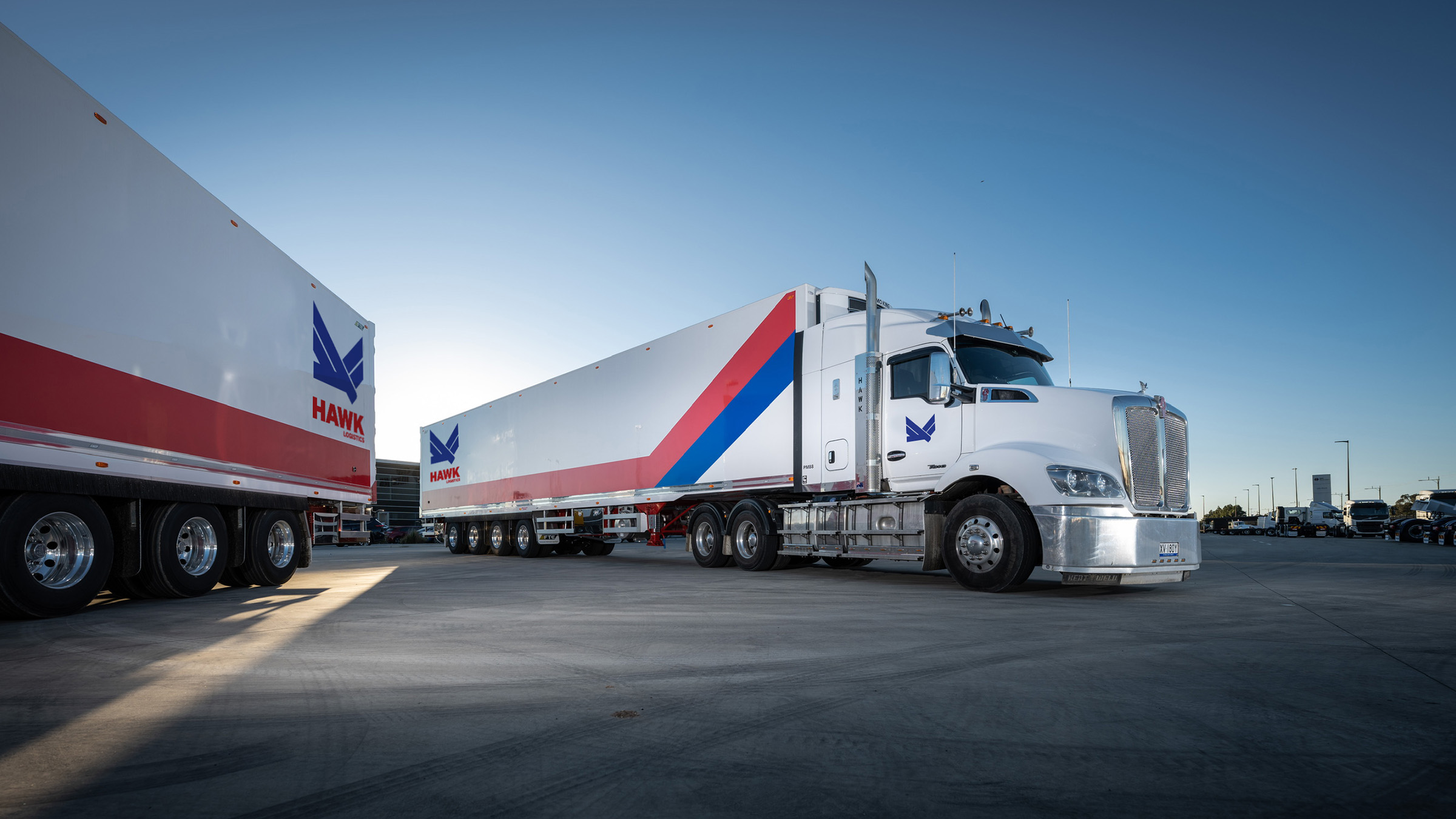
After a decade of growth, Hawk Logistics needed a brand that matched its expanding scale and future ambition, while retaining the equity of its established identity. We delivered a complete rebrand and website that captured this evolution. The signature blue and red palette was retained to preserve recognition in a competitive market, while a refined visual system introduces greater clarity, flexibility and consistency. The redesigned website simplifies the digital experience, reinforcing the company’s values of safety, reliability and long-term partnership.